Why a design system for a personal app?
In Devlog 1, I covered Kattruko’s genesis — a study companion plugged into Obsidian. Here, we dive into the visual identity: the Matcha Latte design system.
I asked myself this question early on. Kattruko is a closed project, used by one person (me). Why spend time documenting colors, spacing, and typography rules? Wouldn’t it be faster to just code directly?
The answer came after a few weeks of development. At first, I picked colors by feel. A green here, a gray there, a warm tone for buttons. It worked, but there was a problem: moving from one screen to another, the app had no identity. Every page looked like it had been designed separately.
That’s when I realized a design system isn’t for other people. It’s for you, six months from now, when you come back to a screen you haven’t touched in three weeks and need to find the right values again. Without documentation, you guess. With it, you apply.
The problem: study apps are ugly or cold
Look at Anki. It’s an incredible tool, the industry standard for memorization. But objectively, the interface is functional at best. Default Qt colors, system fonts, no personality.
On the other end, modern apps often go the opposite direction: polished design but a cold atmosphere. Blue tones, sharp angles, dashboard energy. That works for a productivity tool, but not for something meant to make you want to learn.
Kattruko needed a third path: a deliberately recognizable design that doesn’t shout. Something calm. Something that feels like a notebook and a coffee shop.
The Matcha Latte philosophy
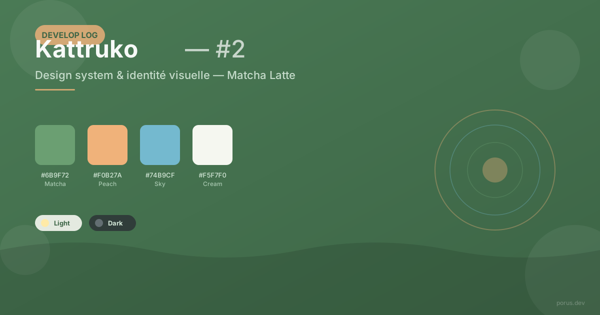
The palette name came early and never left. Matcha for the green tea, latte for the warm milk. A fresh green, cream and peach tones, an organic atmosphere, not a technological one.
The main green (#6B9F72) evokes leaves, nature, growth. It’s a color that doesn’t surprise you, that rests. On the other side, the peach (#F0B27A) brings warmth without aggression. Neutrals (cream, soft gray, off-white) tie it all together.
For typography, I chose Inter. It’s a font designed for screens – slightly open curves, generous x-height. It reads as technical without being cold. Figma and GitHub use it, and I think it captures what I want for Kattruko: a serious tool, not a game app.
The real work was creating two themes – light and dark – that share the same identity. Not a simple color invert. Light mode is fresh and airy, inspired by paper. Dark mode is deep and dim, like a reading screen at night. Both use the same base colors, but the proportions shift: green becomes more present in dark mode, peach more subtle.
The challenges: cross-platform consistency and documentation
The biggest technical challenge was making this design system work consistently on mobile and desktop with Flutter. Material 3 gives you a solid foundation, but fine customization means overriding everything – card colors, button colors, text fields, dialogs. And every override must work in both themes.
One concrete example: the quiz card in dark mode. On mobile, a slightly gray background with a subtle border works well. On desktop (Flutter web), shadow rendering is different, borders stand out more. I had to adjust surface and border values separately for each platform.
The other challenge was more philosophical: document without over-engineering. A design system can become a factory – JSON files, theme generators, tokens everywhere. For a personal project, I went the opposite direction: a single DESIGN.md file, well-structured, with colors, spacing, font sizes, and usage rules. Enough that I can find a value without searching, light enough that I dare to change it.
What I learned
What surprised me most is how much a design system changes the way you code. When every color has a name and a reason, you hesitate less. You know the main green is called “matcha” and it’s reserved for primary actions. You don’t wonder “should I use #5A8F62 or #6B9F72” for every button.
And that creates consistency without effort. No green that drifts toward blue because you typed the wrong value. No gray that changes from page to page. The app has a voice.
What’s next
The next devlog will cover Obsidian note import – the multi-pass scanner, wikilinks, and how to extract meaning from markdown files without breaking everything.
In the meantime, Kattruko continues in closed development. The Matcha Latte design system is stable, documented, and applied. It’s the foundation for everything that follows.
→ Interested in learning philosophy? Check out “Better a flat earther who reasons than an expert who can’t explain”. And if you missed the start, Devlog 1 covers the project’s genesis.